

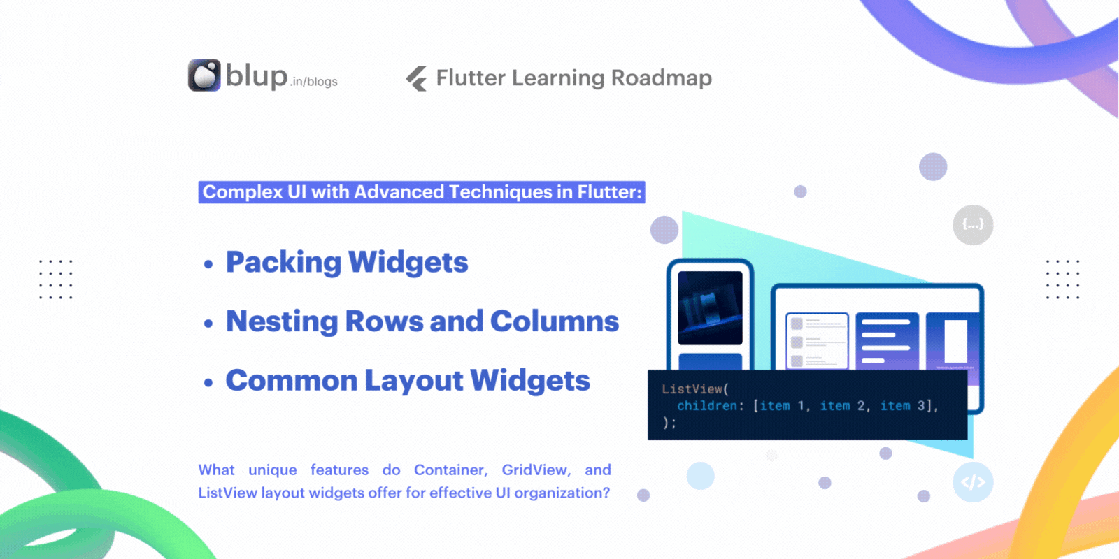
Build Complex UI in Flutter: Container, GridView & Nesting
Introduction
Welcome to our comprehensive guide on building complex UIs with advanced techniques in Flutter. As Flutter continues to gain popularity for its flexibility and power in creating beautiful user interfaces, mastering layout design becomes increasingly crucial for developers. In this blog, we will delve into advanced techniques that will elevate your Flutter UI development skills to the next level.
Before we dive into the specifics, let's start with some engaging facts:
- Did you know that Flutter's layout system is based on a powerful and flexible widget tree, allowing for highly customizable UI designs?
- Are you aware that mastering advanced layout techniques can significantly improve the performance and responsiveness of your Flutter apps?
- Can you identify the benefits of using containers, grid views, list views, and nesting rows and columns in Flutter development?
Now, let's engage with some quizzes to kickstart our journey into advanced layout design.
Packing Widgets: How do padding and margin widgets help in creating consistent spacing between UI elements?
Nesting Rows and Columns: What are the advantages of using nested row and column widgets for building complex layouts in Flutter?
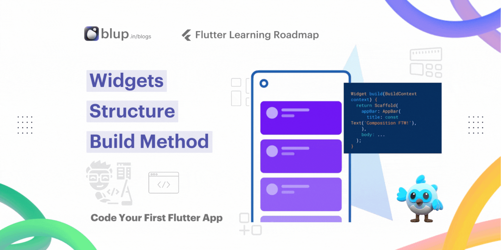
Common Layout Widgets: Which layout widgets—Container, GridView, and ListView—offer unique features and functionalities for organizing UI elements effectively?
As we explore advanced techniques like packing widgets, nesting rows and columns, and leveraging common layout widgets such as Container, GridView, and ListView, get ready to expand your knowledge and enhance your Flutter UI development skills. Let's embark on this journey together!
Packing Widgets
In Flutter, crafting intricate user interfaces (UI) requires efficiently mastering the art of packing widgets. This section delves into the concept of tightly packing widgets using Padding and Margin widgets to ensure consistent spacing and enhance visual appeal.
Packing widgets
By default, a row or column occupies as much space along its main axis as possible, but if you want to pack the children closely together, set it mainAxisSize to MainAxisSize.min. The following example uses this property to pack the star icons together.
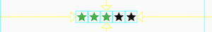
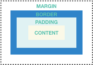
Padding Widget:
The Padding widget is instrumental in adding internal space within a widget or between multiple widgets. It enables precise control over the spacing within UI components.
Here, a Padding widget envelops a Container widget containing text. The EdgeInsets.all(16.0) parameter adds 16.0 pixels of padding around the child widget, maintaining space between the text and the container's edges.
Margin Widget:
Conversely, the Margin widget adds space outside a widget, facilitating separation between different UI elements or a widget and its parent container.
In this example, a Container widget is given a vertical margin of 10.0 pixels using EdgeInsets.symmetric(vertical: 10.0), creating space above and below the container, thereby delineating it from adjacent widgets.
Achieving Consistent Spacing:
By judiciously employing Padding and Margin widgets, developers can ensure uniform spacing throughout the UI, fostering a polished and cohesive design.
In this scenario, a Column widget contains three Text widgets, each encased in a Padding widget with consistent padding. This approach maintains uniform spacing between text elements, ensuring visual harmony within the layout.
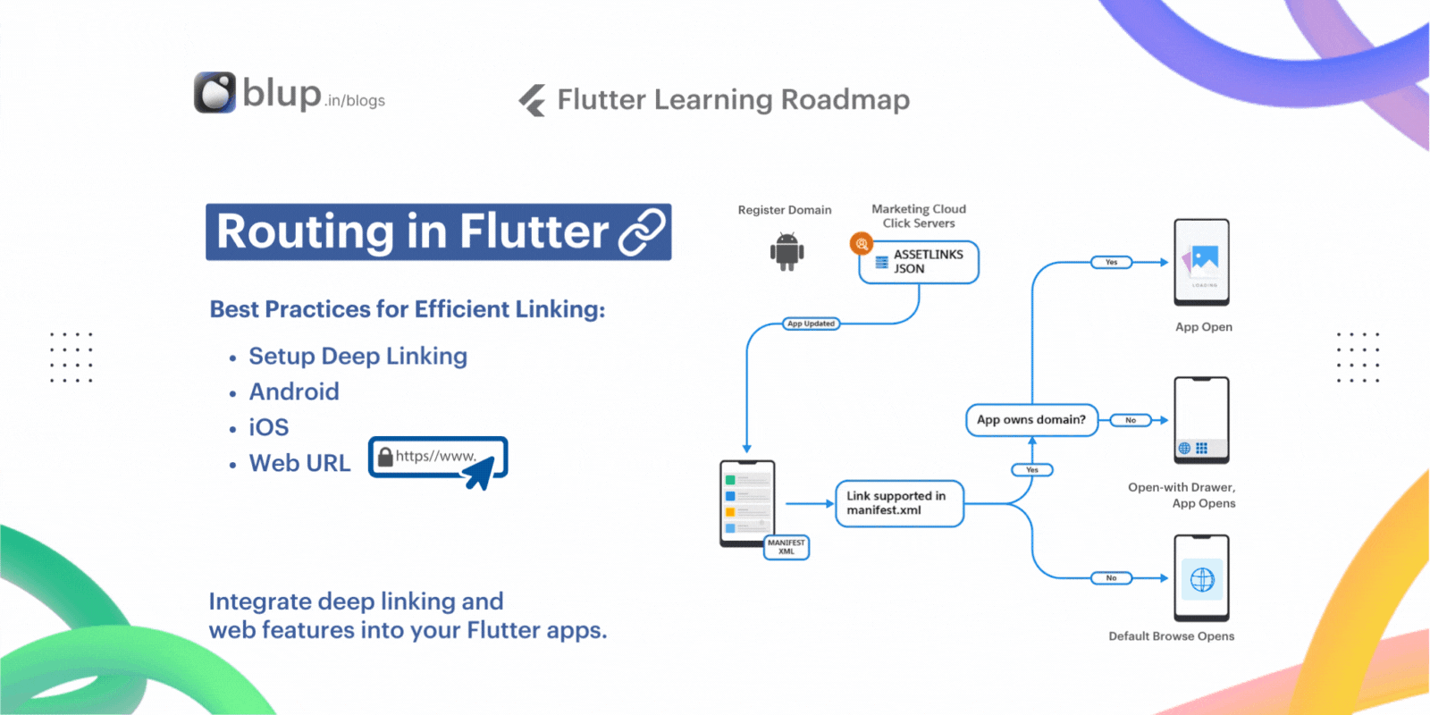
Nesting Rows and Columns
The Flutter layout framework enables the nesting of rows and columns to create intricate layouts. Let's examine the code for a specific section of the Pavlova app's layout.
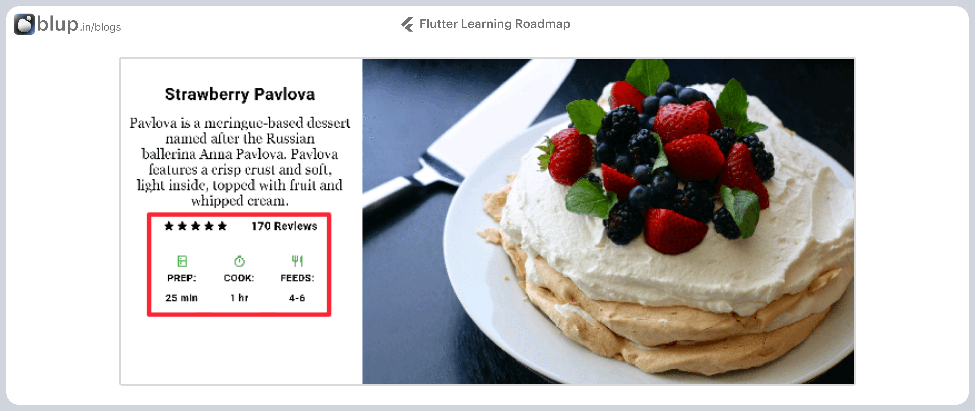
The outlined section comprises two rows: the rating row displaying five stars and the number of reviews, and the icons row containing three columns of icons and text.
Rating Row Widget Tree:
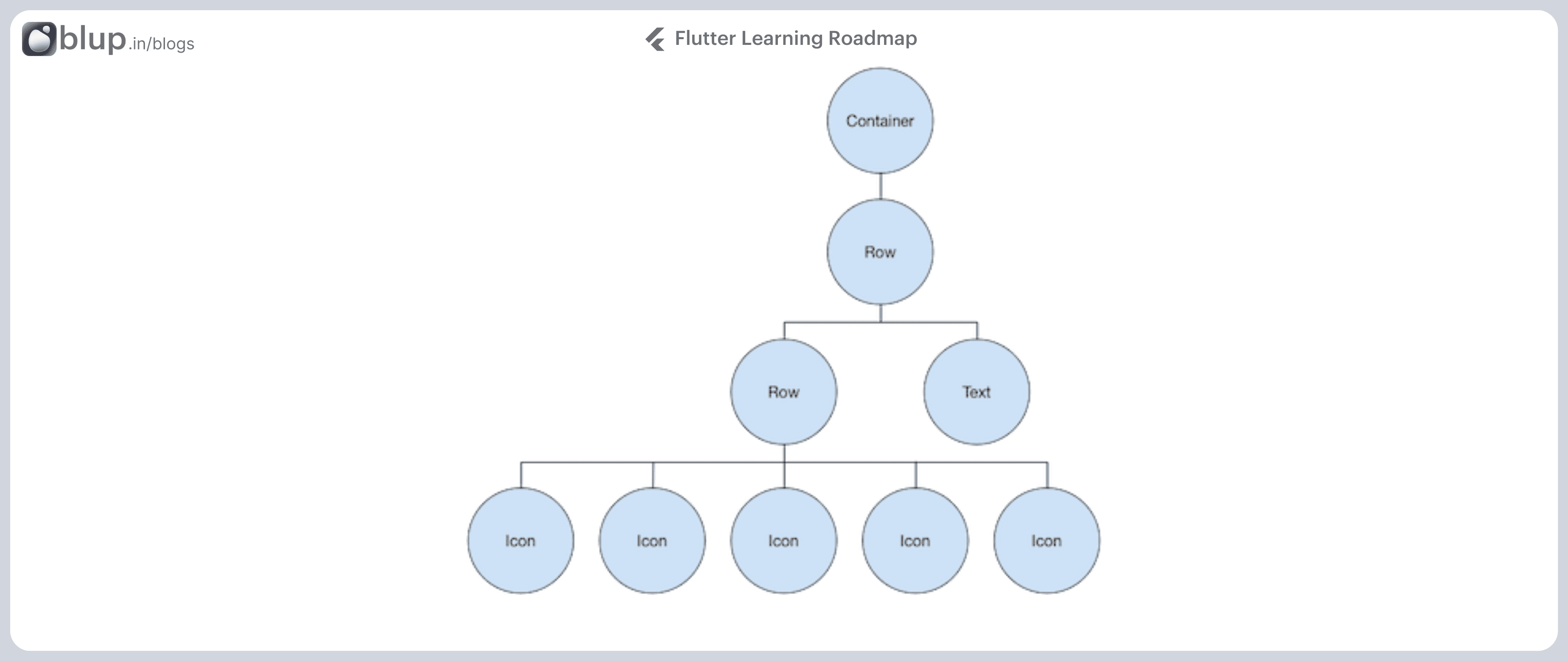
Icons Row Widget Tree:
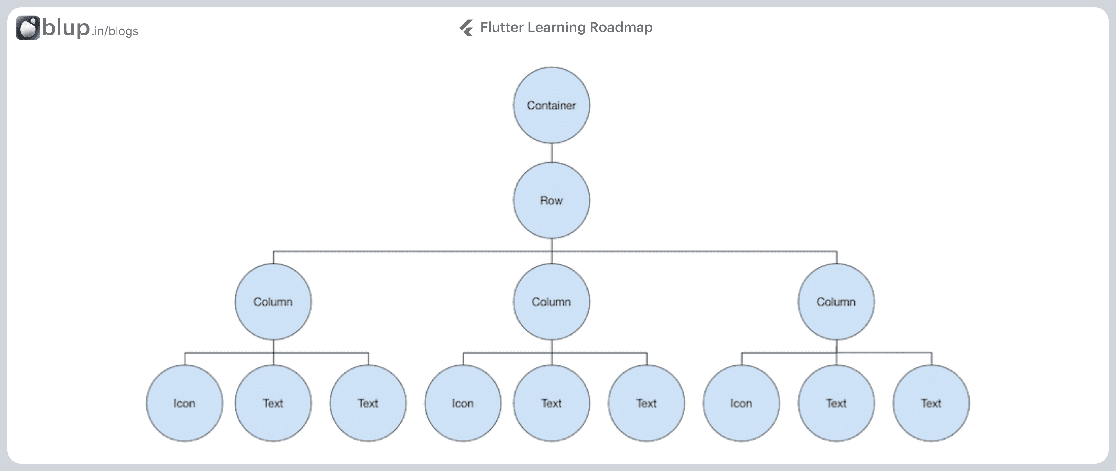
The leftColumn variable encompasses the ratings and icons rows, along with the title and description of Pavlova.
The entire row, containing the left column and the image, is enclosed in a Card widget.
This layout runs best horizontally on a wide device, such as a tablet, and showcases the potential of nested rows and columns in Flutter app development.
Common Layout Widgets - Part 1
Flutter has a rich library of layout widgets. Here are a few of those most commonly used. The intent is to get you up and running as quickly as possible, rather than overwhelm you with a complete list. For information on other available widgets, refer to the Widget catalog, or use the Search box in the API reference docs. Also, the widget pages in the API docs often make suggestions about similar widgets that might better suit your needs.
The following widgets fall into two categories: standard widgets from the widgets library, and specialized widgets from the Material library. Any app can use the widgets library but only Material apps can use the Material Components library.
Standard widgets
Container: Adds padding, margins, borders, background color, or other decorations to a widget.GridView: Lays widgets out as a scrollable grid.ListView: Lays widgets out as a scrollable list.Stack: Overlaps a widget on top of another.
Container:
The Container widget is a versatile tool for creating custom UI elements with control over properties like alignment, padding, margin, decoration, and more.
Summary (Container)
Add padding, margins, borders
Change the background color or image
Contains a single child widget, but that child can be a Row, Column, or even the root of a widget tree
Utilize BoxDecoration to add visual effects like gradients, borders, shadows, etc., to your Container, enhancing its appearance and making it visually appealing.
GridView:
GridView is perfect for arranging widgets in a grid layout, allowing you to display items in a two-dimensional scrolling grid.

Customize grid layout using SliverGridDelegateWithFixedCrossAxisCount or SliverGridDelegateWithMaxCrossAxisExtent, adjusting cross-axis count or item extent according to your design requirements.
ListView:
ListView is ideal for displaying a scrollable list of items, whether vertically or horizontally.
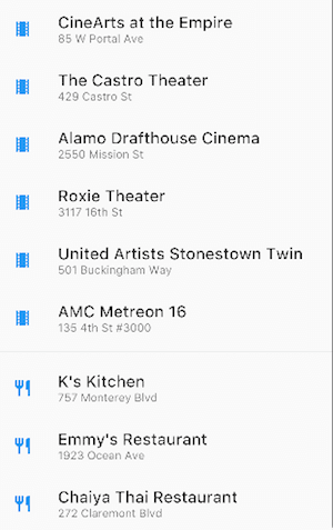
Optimize ListView performance using ListView.builder for lazy loading of items, reducing memory consumption, and enhancing app performance, especially with large datasets.
Advanced Tips and Tricks:
Performance Optimization: For large datasets, consider using GridView.builder and ListView.builder to create efficient, lazy-loading grids and lists.
Customization: Experiment with BoxDecoration and other styling options within Container to achieve unique visual effects.
Responsive Design: Utilize Expanded and Flexible widgets within GridView and ListView to create responsive layouts that adapt to different screen sizes.
Advanced Widget Techniques
we'll delve into advanced techniques for layout customization in Flutter. We'll explore leveraging constraints, alignment properties, optimizing performance, and building responsive designs.
Optimizing Performance:
When dealing with complex UI designs, optimizing performance is crucial. Here are some strategies to enhance performance:
Minimize Rebuilds: Use
constconstructors wherever possible to avoid unnecessary widget rebuilds.Key Widget Reuse: Utilize keys to ensure widgets are reused efficiently, reducing rendering overhead.
State Management: Employ efficient state management techniques like Provider or Riverpod to minimize unnecessary widget rebuilds.
Responsive Design:
Creating layouts that adapt seamlessly to different screen sizes and orientations is essential for a polished user experience. Here's how to achieve responsive designs:
MediaQuery: Use MediaQuery to access the device's size and adapt layout elements accordingly.
LayoutBuilder: Utilize LayoutBuilder to build layouts based on the parent widget's constraints, allowing for dynamic adjustments.
Flexible and Expanded Widgets: Use Flexible and Expanded widgets within Rows and Columns to create responsive layouts that adjust to available space.
Advanced Tips and Tricks:
Custom Constraints: Create custom constraints using LayoutBuilder and ConstrainedBox to precisely control widget sizes and positions.
Custom Paint: Leverage the CustomPaint widget to draw complex shapes or implement custom designs directly within your UI.
Performance Profiling: Utilize Flutter's built-in performance profiling tools to identify performance bottlenecks and optimize your app's rendering speed.
State Management in Complex UI
Managing state effectively within complex UI designs is crucial for maintaining consistency and responsiveness. In Flutter, there are various state management solutions available, each catering to different requirements and preferences. Let's explore two popular options: Provider and Bloc.
Key Questions on State Management in Complex Flutter UIs
What is state management in Flutter, and why is it important in complex UI designs?
How does Provider differ from Bloc in Flutter state management?
What are the benefits of using Provider for state management in Flutter?
Can you provide examples of using Provider and Bloc for state management in Flutter?
How do you choose the appropriate state management solution for a complex Flutter UI project?
1. Provider:
Provider is a simple and efficient state management solution that leverages Flutter's InheritedWidget mechanism. It allows for the propagation of state changes across the widget tree, ensuring that UI elements update appropriately in response to data changes.
2. Bloc:
Bloc (Business Logic Component) is a pattern that separates business logic from UI components, making it suitable for complex applications. It relies on streams and sinks to manage the state and facilitate communication between different parts of the application.
Both Provider and Bloc offer powerful state management solutions for complex UI designs in Flutter. Depending on the project requirements and personal preferences, developers can choose the approach that best suits their needs. By effectively managing the state, Flutter developers can build responsive and scalable applications with ease.
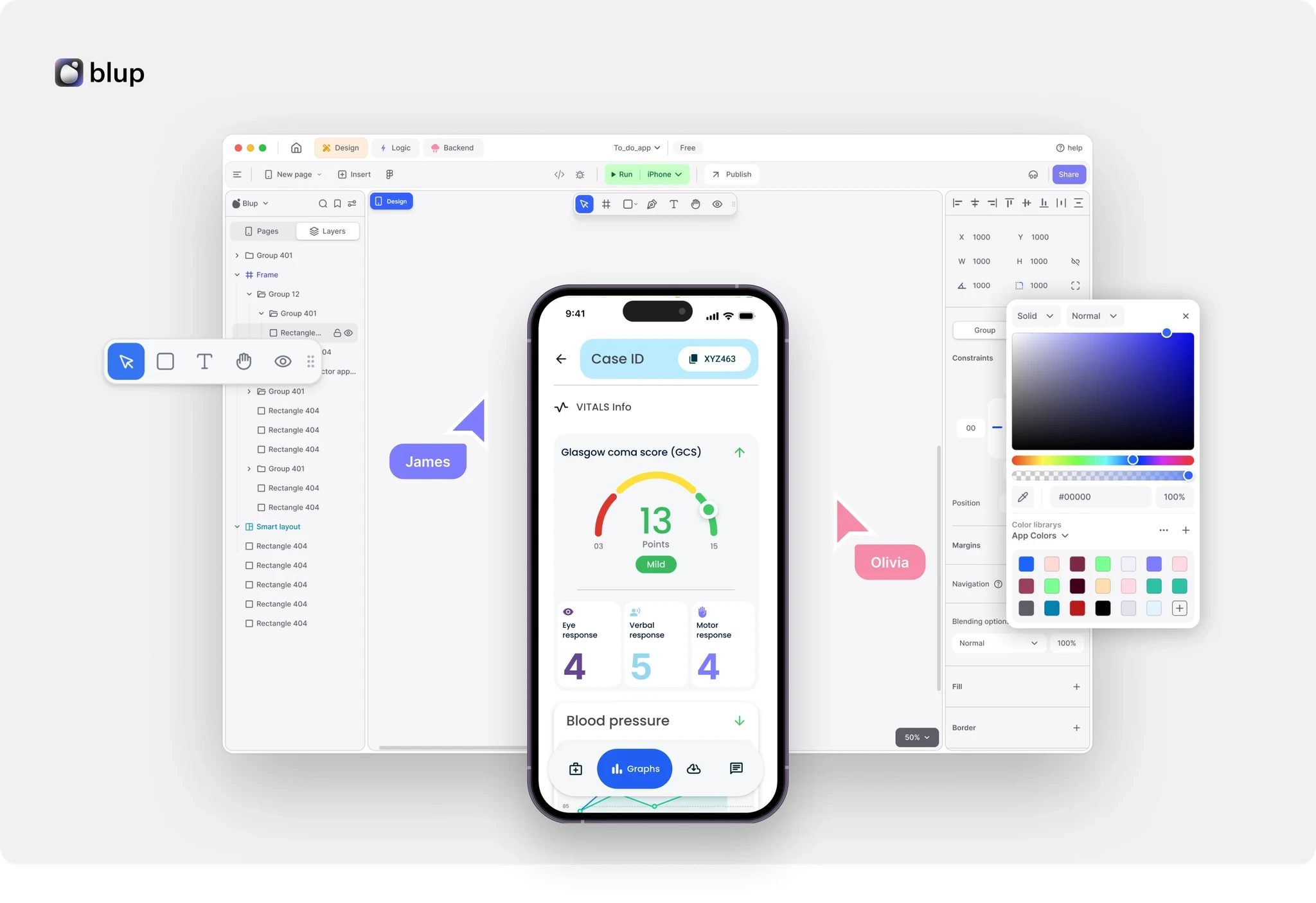
Download the Blup Tool now
Transform Your App Development Journey with Just One Click!
🚀 Ready to Elevate Your App Building Experience? Discover the power of simplicity and efficiency with the Blup Tool. Say goodbye to complex coding and hello to a world where creating your dream app is just a matter of a few intuitive steps. Whether you're a seasoned developer or just starting, the Blup Tool is your gateway to turning ideas into reality, effortlessly.
🌟 Download the Blup Tool now and join the revolution of streamlined, no-code app development. Your journey towards creating amazing apps with ease starts here!
Resources to Get Started
Conclusion
As we wrap up our journey into building complex UIs with advanced techniques in Flutter, let's recap the key points covered and discuss the next steps for further exploration.
Recap of Key Points:
Throughout this blog, we delved into various advanced techniques essential for crafting sophisticated user interfaces in Flutter:
Utilizing the Container widget for custom styling and layout.
Harnessing the power of GridView and ListView for dynamic content display.
Mastering the art of nesting Rows and Columns for flexible UI arrangements.
Exploring state management solutions like Provider and Bloc for handling complex UI interactions.
Next Steps:
These techniques, when applied effectively, empower developers to create visually stunning and highly functional applications across different domains.
Deepen your understanding of Flutter UI techniques:
Experiment and Practice: Dive into Flutter's documentation and apply techniques in your projects.
Explore Additional Packages: Discover packages like flutter_bloc for state management or flutter_staggered_grid_view for advanced layouts.
Engage with the Community: Join forums and meetups for knowledge sharing and collaboration.
Engagement:
Share your experiences and insights with us! Let's push the boundaries of Flutter UI together. Happy coding! 🚀✨


