

Flutter Animation Fundamentals: Enhancing User Experience

Overview of Animations in Flutter
Greetings, fellow developer! Are you ready to dive deep into the fascinating world of Flutter animations? In this article, I'll guide you through everything you need to know about animations in Flutter, from the basics to advanced techniques.
Animations are integral to enhancing user experience, breathing life into mobile applications, and transforming static interfaces into dynamic experiences that captivate users' attention. Flutter, Google's innovative UI toolkit, empowers developers to craft stunning animations effortlessly, elevating user experience to new heights.
Did you know that animations can increase user engagement and retention by making interactions more intuitive and enjoyable?
Research suggests that well-designed animations can significantly enhance users' perception of an app's quality and professionalism.
Common Questions:
How do animations enhance user experience in mobile applications?
What tools and techniques are available in Flutter for creating animations?
By the end of this article, you'll have a thorough understanding of Flutter animations, enabling you to incorporate them into your app with confidence. Whether you're aiming for simple transitions or complex visual effects, you'll discover the right approach to achieve your animation goals in Flutter.
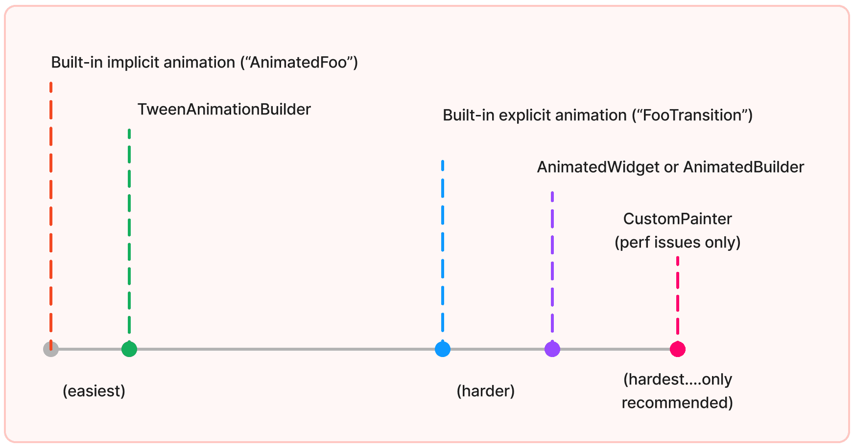
Choosing an approach
When it comes to creating animations in Flutter, there are multiple approaches you can take, each suited to different needs and levels of complexity.
To help you determine the best approach for your specific use case, check out the video, "How to Choose Which Flutter Animation Widget Is Right for You?"
In the video, you’ll find a detailed explanation of various animation techniques available in Flutter, including their pros and cons. To dive deeper into the decision process, consider the following decision tree, which simplifies choosing the right animation approach:
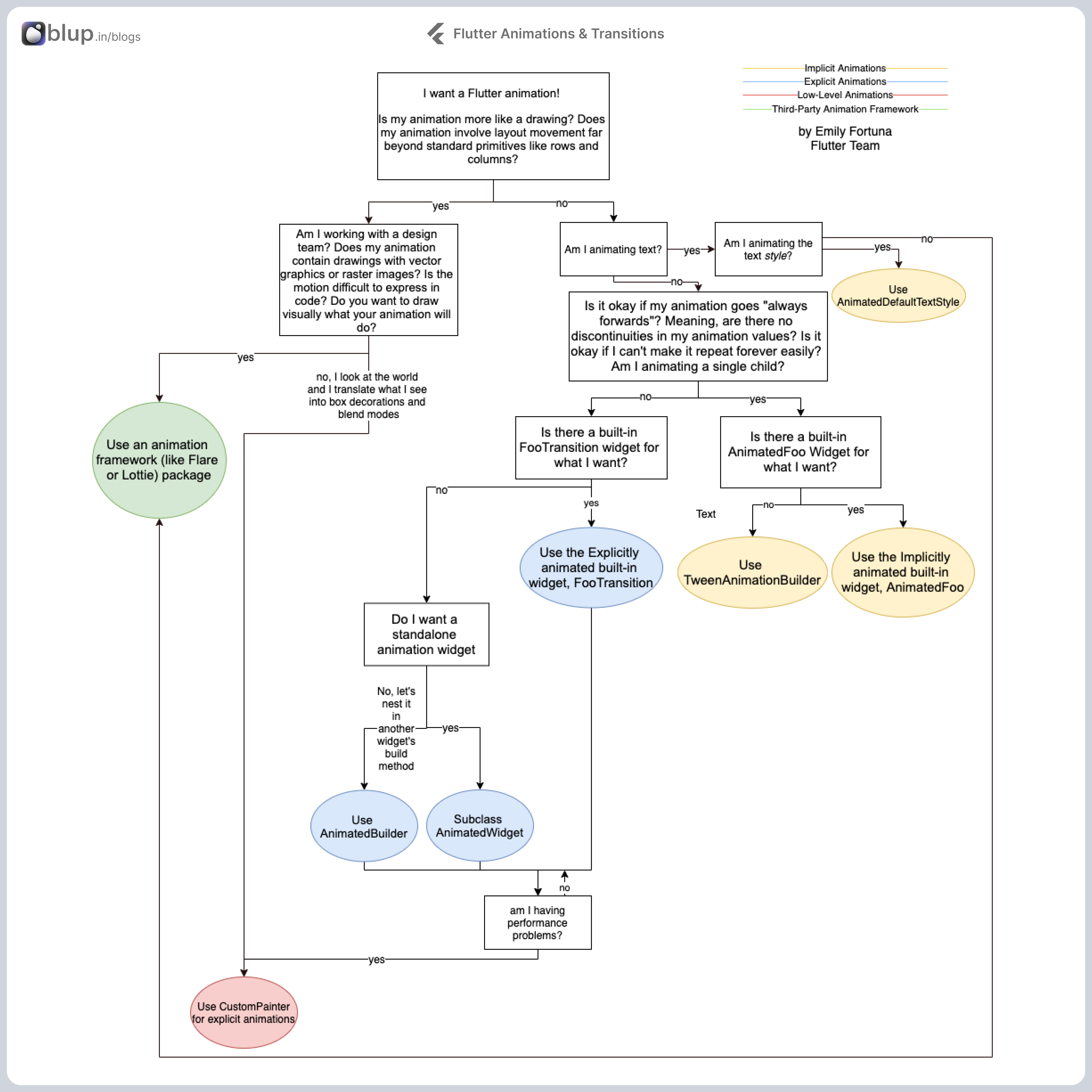
Deciding on the Right Animation Approach
As demonstrated in the video, the following decision tree can help you determine the most suitable approach for implementing animations in your Flutter app:
Implicit Animations:
Use Case: Simple animations with minimal control are needed.
Widgets to Use: AnimatedContainer, AnimatedOpacity, AnimatedAlign, etc.
Pros: Easy to implement with minimal code.
Cons: Limited control over animation sequences and timing.
Explicit Animations:
Use Case: Complex animations requiring fine-tuned control.
Widgets to Use: AnimationController, Tween, AnimatedBuilder, etc.
Pros: High degree of control over animation details.
Cons: Requires more code and understanding of animation principles.
Hero Animations:
Use Case: Animations between different screens.
Widgets to Use: Hero.
Pros: Simplifies transitions between screens.
Cons: Limited to transitions involving shared elements.
Custom Animations:
Use Case: Highly customized animations that don't fit into standard patterns.
Widgets to Use: CustomPainter, Flare, Rive, etc.
Pros: Infinite customization potential.
Cons: Requires in-depth knowledge and significant coding effort.
Each of these approaches offers unique benefits, and the best one for your project will depend on the specific requirements and complexity of the animations you wish to implement. By following the decision tree and considering your specific needs, you can choose the most suitable animation technique, ensuring a seamless and engaging user experience in your Flutter app.
Flutter Animation Framework
Flutter's animation framework revolves around three fundamental concepts:
1. Tween
The Tween<T extends Object?> class in Flutter provides a linear interpolation between a beginning and ending value, which is particularly useful for creating smooth transitions across a range of values.
To use a Tween object with animation, you call its animate method and pass in the Animation object you want to modify. Additionally, you can chain Tween objects using the chain method to configure a single Animation object with multiple Tweens sequentially. This is different from calling the animate method twice, which would create two separate Animation objects.
Creating an Animation<Offset>
Suppose _controller is an AnimationController, and we want to create an Animation<Offset> controlled by this controller and saved it in _animation. Here are two possible ways to achieve this:
Method 1: Using drive() Method
Method 2: Using animate() Method
In both cases, the _animation the variable holds an object that, throughout the _controller's animation provides values (_animation.value) that interpolates linearly between the two offsets specified.
Using MaterialPointArcTween
If you were to use a MaterialPointArcTween instead of a Tween<Offset>, the points would follow a pleasing curve rather than a straight line, with no other changes necessary to the code.
2. Animation
An animation in Flutter consists of a value (of type T) and a status. The status indicates whether the animation is running from beginning to end or from end to beginning. However, the actual value of the animation might not change monotonically, especially if the animation uses a curve that bounces.
Animations allow other objects to listen for changes to either their value or status. These callbacks are triggered during the "animation" phase of the pipeline, just before widgets are rebuilt.
To create a new animation that can run forward and backward, consider using an AnimationController.
See Also:
Tween: Used to create Animation subclasses that convert
Animation<double>instances into other kinds of animations.
Inheritance:
Object > Listenable > Animation
Implemented Types:
Implementers
AlwaysStoppedAnimation, AnimationController, CompoundAnimation, CurvedAnimation, ProxyAnimation, ReverseAnimation, TrainHoppingAnimation.
3. AnimationController
An AnimationController is responsible for controlling the animation's playback, including starting, stopping, and reversing it. It also manages the animation's duration and curve. The AnimationController acts as the conductor of the animation, ensuring it progresses smoothly over time.
An AnimationController in Flutter allows you to control an animation's behavior. With this class, you can:
Set the animation to a specific value.
Define upperBond and lowerBound for the animation.
Create a fling animation effect using a physics simulation.
By default, an AnimationController linearly produces values ranging from 0.0 to 1.0 over a specified duration. It generates a new value whenever the device running your app is ready to display a new frame, typically at a rate of around 60 frames per second.
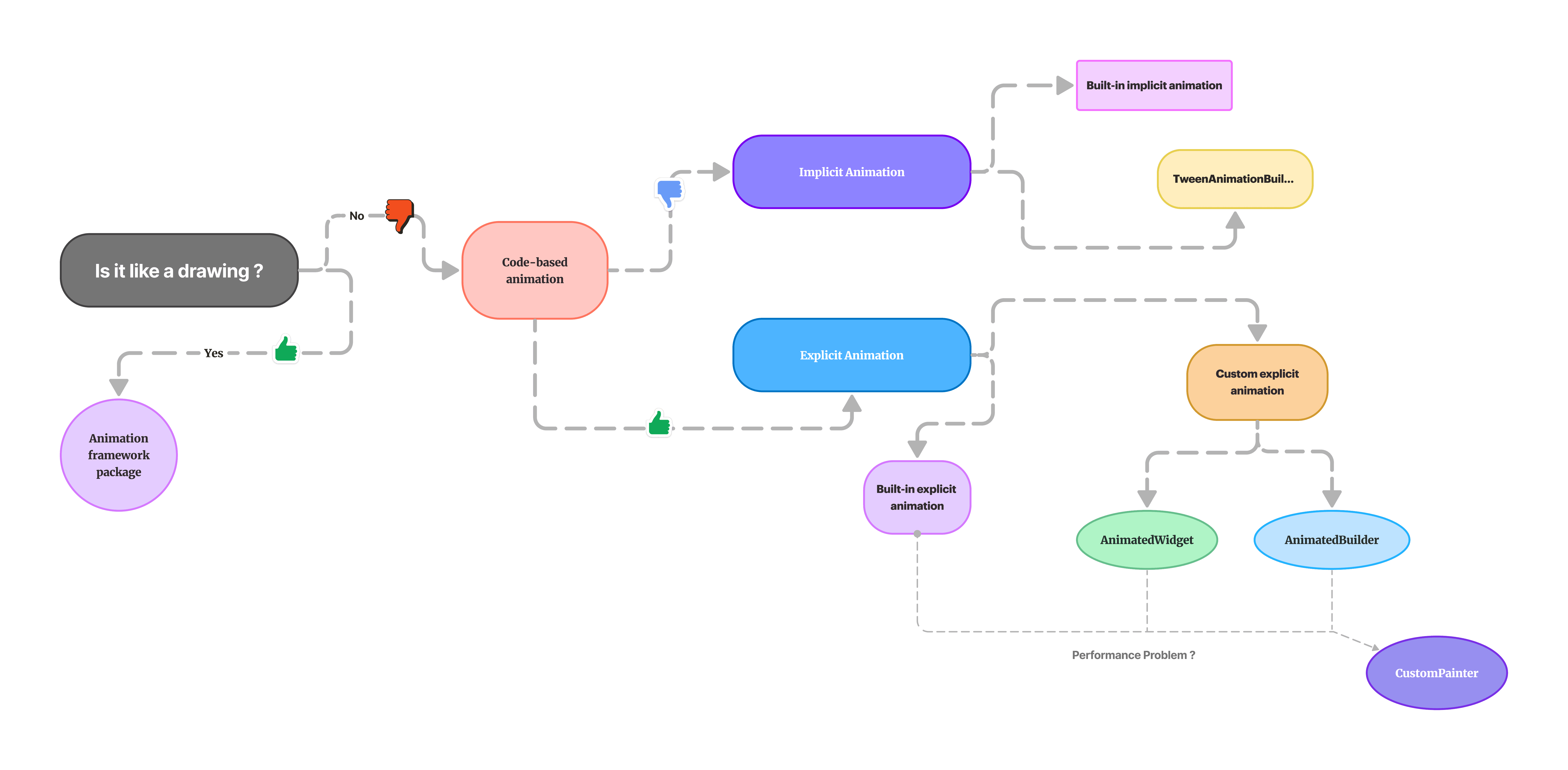
Types of Animations
Broadly speaking, there are two main types of animations that you might want to include in your Flutter app, animations can be categorized into two main types: code-based animations and drawing-based animations.
Code-Based Animations
Code-based animations are widget-focused and rooted in standard layout and style primitives like rows, columns, colors, or text styles. These animations enhance a particular existing widget’s appearance or transition rather than act as a standalone widget. They are typically created and controlled through Flutter's animation framework and can be categorized further into implicit and explicit animations.
Implicit Animations
Implicit animations are built-in widgets that automatically animate changes to their properties. They are easy to use and require minimal code, making them ideal for simple animations. These animations are triggered by changing the properties of the widget, and Flutter handles the rest.
Learn about Animation Basics with Implicit Animations
Common Widgets for Implicit Animations:
AnimatedContainerAnimatedOpacityAnimatedPositionedAnimatedAlignAnimatedPadding
Example: AnimatedContainer
The following example demonstrates how to use AnimatedContainer to animate the change in its properties such as width, height, and color.
Explicit Animations
Explicit animations provide more control and flexibility compared to implicit animations. They require more code and are created and controlled explicitly by the developer using AnimationController and other animation-related classes. Explicit animations are useful for creating complex and highly customized animations.
Core Components:
AnimationControllerAnimationTweenCurvedAnimation
Watch Creating custom explicit animations with AnimatedBuilder and AnimatedWidget.
Example: Explicit Animation with AnimationController
The following example demonstrates how to create an explicit animation using AnimationController and Tween.
Drawing-Based Animations
Drawing-based animations, in contrast, look like they were drawn rather than built from standard Flutter widgets. They often are stand-alone sprites, like game characters, or involve transformations that would be challenging to express purely in code. If your animation resembles a drawing or you are working with a design team that will provide vector or raster image assets, then using a third-party tool such as Rive or Lottie is recommended. These tools allow you to build your animation graphically and then export it to Flutter.
Popular Tools for Drawing-Based Animations:
Rive: Allows designers to create intricate animations and state machines that can be embedded into Flutter applications.
Lottie: A library that parses Adobe After Effects animations exported as JSON with Bodymovin and renders them natively in Flutter.
Example: Integrating a Lottie Animation
The following example demonstrates how to integrate a Lottie animation into a Flutter app.
Implicit Animations
Main Entry Point
main(): This is the entry point of the Flutter application. It runs the app by calling runApp() with an instance of MyApp.
MyApp Widget
MyApp: This is a stateless widget that builds the main structure of the app.
MaterialApp: This widget sets up the app with Material Design.Scaffold: This widget provides a basic structure for the app's visual interface, including anAppBarand abody.AppBar: The top bar displaying the title "Implicit Animations".ImplicitAnimationExample: This is a custom stateful widget that will contain the implicit animation.
ImplicitAnimationExample Widget
ImplicitAnimationExample: A stateful widget that creates an instance of _ImplicitAnimationExampleState where the animation logic resides.
_ImplicitAnimationExampleState Class
Explanation of the Animation
Stateful Widget
Stateful Widget:
ImplicitAnimationExampleis a stateful widget that has an internal state managed by_ImplicitAnimationExampleState.
State Management
State Variable:
_toggledis a boolean state variable initialized tofalse. It is used to toggle the animation's properties.
Gesture Detection
GestureDetector: This widget detects tap gestures. When the container is tapped, it toggles the
_toggledstate.
AnimatedContainer
AnimatedContainer: This is a special container that automatically animates changes to its properties over a specified duration using an implicit animation.
Properties:
width: Changes between 200 and 400 depending on the value of_toggled.height: Changes between 200 and 400 depending on the value of_toggled.color: Changes betweenColors.redandColors.bluedepending on the value of_toggled.alignment: Changes betweenAlignmentDirectional.topCenterandAlignment.centerdepending on the value of_toggled.duration: Specifies the duration of the animation (1 second).curve: Specifies the animation curve (Curves.easeInOut), which controls the timing of the animation.
Rebuilding the Widget
setState(): When the container is tapped,
setState()is called to toggle_toggledand rebuild the widget with the new state. This triggers theAnimatedContainerto animate the changes to its properties.
Child Widget
Center: Centers its child within itself.
Padding: Adds horizontal padding around the child.
Image.network: Displays an image from a URL inside the container.
How the Animation Works
Initial State: When the app starts,
_toggledisfalse, so theAnimatedContaineris 200x200, red, and aligned at the top center.User Interaction: When the user taps the container,
_toggledis set totrue.State Change:
setState()is called, causing the widget to rebuild with the new state.Animation:
AnimatedContaineranimates the changes to itswidth,height,color, andalignmentover 1 second using theCurves.easeInOutcurve.New State: After the animation completes, the container is 400x400, blue, and centered.
By using AnimatedContainer, this example demonstrates how Flutter makes it easy to create smooth, visually appealing animations with minimal code. The implicit animation takes care of the interpolation and rendering of the animated properties.
Explicit Animations
Main Entry Point
main(): This is the entry point of the Flutter application. It runs the app by calling runApp() with an instance of MyApp.
MyApp Widget
MyApp: This is a stateless widget that builds the main structure of the app.
MaterialApp: This widget sets up the app with Material Design.Scaffold: This widget provides a basic structure for the app's visual interface, including anAppBarand abody.AppBar: The top bar displaying the title "Explicit Animations".ExplicitAnimationExample: This is a custom stateful widget that will contain the animation.
ExplicitAnimationExample Widget
ExplicitAnimationExample: A stateful widget that creates an instance of _ExplicitAnimationExampleState where the animation logic resides.
_ExplicitAnimationExampleState Class
_ExplicitAnimationExampleState: This is the state class that manages the state of ExplicitAnimationExample.
SingleTickerProviderStateMixin: A mixin that provides aTicker, which is necessary for driving the animation. It helps theAnimationControllerto know when to tick.late: Used to declare that the variables_controllerand_animationwill be initialized later.
initState Method
initState(): This method is called when the state is first created.
AnimationController: This controls the animation. It is initialized with a duration of 2 seconds andvsyncset tothis(the current state object), which ensures that the animation ticks are synchronized with the screen refresh rate. Therepeatmethod is called to make the animation loop back and forth.Tween<double>: This defines a transition from 0 to 300 over the animation duration.animate(): This method connects theTweento theAnimationController.addListener(): Adds a listener that callssetState()on every tick of the animation to rebuild the widget with the updated animation value.
dispose Method
dispose(): This method is called when the widget is removed from the widget tree. It disposes of the AnimationController to free up resources.
build Method
build(): This method builds the UI for the state.
Center: Centers its child within itself.Container: A box model widget that can be customized. It uses the current value of the animation to set its height and width, creating the animation effect.margin: Adds vertical spacing around the container.FlutterLogo: A widget that displays the Flutter logo, which will be animated in size based on the animation value.
Summary
Initialization: The
AnimationControllerandTweenare set up ininitState.Animation Loop: The controller is set to repeat, making the animation loop back and forth.
Rebuild on Change: The animation's
addListenercallssetStateto update the UI whenever the animation value changes.Resource Management: The
disposemethod ensures that resources are freed when the widget is no longer in use.Dynamic UI: The build method uses the animation value to dynamically adjust the size of the
Container, providing a smooth animation effect.
Drawing-Based Animations
Let's create an example of a drawing-based animation that draws a circular progress indicator. This animation will simulate the progress of a task, gradually filling up a circle as the task progresses.
Here's the code:
Explanation
CircularProgressAnimation Widget: This is the main widget responsible for displaying the circular progress animation. It uses a
CustomPaintwidget to draw the progress indicator.CircularProgressPainter Class: This class extends
CustomPainterand is responsible for painting the circular progress indicator on the canvas.Painting the Progress: In the
paintmethod ofCircularProgressPainter, we calculate the angle of progress based on the animation value (progress). We then draw an arc representing the progress using the calculated angle.Animation Controller: We use an
AnimationControllerto control the animation of the progress indicator. The animation duration is set to 5 seconds, and it repeats indefinitely.Animation Value Listener: We add a listener to the animation to update the UI whenever the animation value changes. This causes the circular progress indicator to be repainted with the new progress value.
Resources and Key Summaries
Blog Series: Mastering Animations and Transitions in Flutter.
Blog 1: Introduction to Animations in Flutter
Key Concepts:
Tween, Animation, and AnimationController: The building blocks of Flutter animations.
Types of Animations: Implicit vs. explicit animations.
Read More:
Blog 2: Exploring Implicit Animations in Flutter
Explains implicit animations and their use cases.
Lists common widgets like
AnimatedOpacity,AnimatedPadding, andAnimatedAlign.
Read More:
Blog 3: Diving into Explicit Animations in Flutter
Differences between implicit and explicit animations.
Core components:
AnimationController,Animation, andTween.
Read More:
Blog 4: Advanced Animation Techniques in Flutter
Animating multiple properties using
TweenSequenceandInterval.Creating complex sequences with staggered animations.
Building custom animated widgets.
Read More:
Blog 5: Leveraging Animation Libraries in Flutter
Introduction to popular animation libraries like
flutter_animateandrive.Basic setup and examples using
flutter_animate.Integrating Rive animations into Flutter apps.
Read More:
Blog 6: Creating Seamless Transition Animations in Flutter
Introduction to page transitions and custom transitions.
Using
PageRouteBuilderfor custom transitions.Creating smooth transitions with
Herowidgets and shared element transitions.
Read More:
Blog 7: Optimizing Animation Performance in Flutter
Identifying common performance bottlenecks.
Techniques for optimizing animations for smooth performance.
Using Flutter's performance tools to monitor and improve animations.
Read More:
Blog 8: Real-World Examples and Case Studies of Flutter Animations
Analysis of popular apps with rich animations (e.g., a weather app).
Breakdown of complex transitions in productivity apps.
Best practices and lessons learned from real-world examples.
Read More:
This series covers everything from the basics to advanced animation techniques, including real-world examples and performance optimization. Each blog post is designed to provide detailed insights and practical examples to help you master Flutter animations and transitions.
Download Our Flutter-based App Builder - Blup
Are you ready to revolutionize your app development experience? Say hello to Blup – the ultimate Flutter-based low-code Procode tool that empowers you to create stunning app UIs, logic, and backend seamlessly, all within a visual environment.
Why Blup?
Flutter-Powered: Built on Flutter, Blup harnesses the power of Google's UI toolkit to deliver high-performance apps.
Low-Code, Procode: Whether you're a seasoned developer or a beginner, Blup's intuitive interface and visual environment make app development a breeze.
Stunning UIs: With Blup, you can create visually stunning UIs that captivate users and elevate your app's aesthetics.
Fast and Affordable: Say goodbye to long development cycles and hefty costs. Blup offers the fastest and most cost-effective way to build apps.
Get Started with Blup Today! ✅
👨🏼💻 Experience the future of app development – download Blup now and unlock your creativity without limits. Whether you're building a personal project or a business app, Blup empowers you to bring your ideas to life in record time. Don't miss out on the opportunity to join the global community of Blup users who are shaping the future of app development.
Conclusion
In this blog series, we've embarked on an exciting journey through the world of Flutter animations.
Understanding Animation Basics: We delved into the importance of animations in enhancing user experience and got acquainted with Flutter's animation framework.
From understanding the basics to mastering advanced techniques, we've explored every facet of animation creation. With practical examples, performance tips, and real-world case studies, we've equipped ourselves with the skills to create captivating user interfaces. Now armed with this knowledge, let's unleash our creativity and bring our Flutter apps to life with dynamic and engaging animations.


