

Advanced Flutter Animations: Staggered & Custom Multi-Property

Introduction
Welcome back to our Flutter Learning Roadmap series! We're thrilled to have you join us as we dive deeper into the fascinating world of Flutter animations. In this installment of the Flutter Animation & Transition series, In the previous blogs of our series, we explored Implicit and Explicit animations in Flutter. Now, let's dive into advanced animation techniques to create dynamic and engaging UIs that captivate users and bring your apps to life.
Flutter, with its powerful framework, allows developers to build visually appealing and highly interactive applications. One of the key aspects that make Flutter stand out is its ability to create smooth and fluid animations effortlessly. Dynamic UI in Flutter not only enhances user experience but also provides a delightful way to convey information and feedback.
In this blog, we'll cover three advanced animation techniques that will elevate your Flutter development skills:
Animating Multiple Properties: Learn how to animate various properties simultaneously using TweenSequence and Interval. This technique is essential for creating complex animations that involve changes in multiple attributes like position, color, and size.
Staggered Animations: Discover the magic of staggered animations, where multiple animations start at different times to create a cascading effect. We’ll walk you through the basic structure of a staggered animation and show you how to implement it using both stateless and stateful widgets.
Custom Animations: Take your animations to the next level by building custom animated widgets. We’ll guide you through the process of creating bespoke animations tailored to your app's unique requirements.
Engaging Facts About Dynamic UI in Flutter
Flutter’s animation framework is highly optimized for performance, ensuring smooth animations even on lower-end devices.
By animating multiple properties, you can create rich, immersive experiences that respond intuitively to user interactions.
Staggered animations can significantly improve the perceived speed of your app by making transitions feel more natural and less abrupt.
Custom animations allow you to design unique visual effects that set your app apart from the competition.
People also Asked:
How can I animate multiple properties of a widget simultaneously in Flutter?
What are the best practices for implementing staggered animations in a Flutter app?
How do TweenSequence and Interval help in creating complex animations?
What are the key differences between using stateless and stateful widgets for animations?
How can I build custom animated widgets that are both efficient and visually appealing?
We hope you’re excited to embark on this journey of advanced Flutter animations. Let's dive in and start bringing your app's UI to life with these powerful techniques!
Animating Multiple Properties
Animating multiple properties in Flutter can greatly enhance the user experience by making transitions smoother and more visually appealing. Flutter offers two powerful tools for this purpose: TweenSequence and Interval. In this section, we will explore how these tools work and provide examples to illustrate their use.
1. Using TweenSequence
Explanation of TweenSequence
A TweenSequence is a sequence of Tween animations that run one after another. It allows you to create complex animations by chaining multiple tweens together, each responsible for animating a specific range of values. This is particularly useful when you want to animate multiple properties in a coordinated manner over the same duration.
A TweenSequence consists of several TweenSequenceItem objects, each specifying a Tween and its relative weight within the sequence. The weights determine how the overall animation duration is divided among the different tweens.
Code Example
Here’s an example of how to use TweenSequence to animate a widget's color and size simultaneously:
https://gist.github.com/ashutoshsr7/b1d497d4018dfc4cf292fb00ceb0e8de
2. Using Interval
Explanation of Interval
An Interval is used to define a specific portion of an animation’s total duration. It allows you to control the timing of different parts of an animation by specifying start and end percentages. This is useful when you want multiple properties to animate at different times within the same overall animation duration.
With Interval, you can create a CurvedAnimation that splits the animation into distinct phases. Each phase can have its own curve, making it possible to stagger the animations of different properties.
Code Example
Here’s an example of how to use Interval to animate different properties at different times:
https://gist.github.com/ashutoshsr7/66fb8e40592cd2c7549a1f9147423218
Explanation of the Mechanism
TweenSequence Mechanism
In the TweenSequence example, we define two TweenSequenceItem objects for both color and size animations. Each TweenSequenceItem specifies a Tween and its weight. The weights determine how the total animation duration is divided among the tweens. The AnimationController drives these animations, and the AnimatedBuilder widget rebuilds the Container whenever the animation values change.
Interval Mechanism
In the Interval example, we define two CurvedAnimation objects with different intervals. The first interval (0.0 to 0.5) handles the color change, while the second interval (0.5 to 1.0) handles the size change. This setup ensures that the color changes during the first half of the animation and the size changes during the second half. The AnimationController drives these animations, and the AnimatedBuilder widget rebuilds the Container whenever the animation values change.
These techniques allow you to create complex, coordinated animations that enhance the user experience by making your app's UI more dynamic and engaging.
Staggered Animations
Staggered animations are a powerful technique in Flutter that allow
w you to create visually appealing and complex sequences of animations. By staggering animations, you can control the start time and duration of multiple animations to produce a coordinated and polished effect. This section will guide you through the basic structure, detailed implementation, and examples of both stateless and stateful widgets for staggered animations.
The video showcases a widget animation: The animation sequence you observed can be summarized as follows.
Fades In: Initially, the widget appears with a faded-in effect, gradually becoming fully visible.
Widens: The widget starts to widen horizontally, expanding its width gradually.
Becomes Taller While Moving Upwards: Simultaneously, the widget moves upwards while increasing its height, creating a stretching effect.
Transforms Into a Bordered Circle: As the widget continues to animate, it transforms from a rectangular shape into a bordered circle.
Changes Color to Orange: Alongside the shape transformation, the widget changes its color from blue to orange.
Reverses Animation: After completing the forward animation sequence, the widget then reverses the animation, going back through each step in reverse order.
The Basic Structure of a Staggered Animation
Explanation of the Core Components
A staggered animation consists of multiple individual animations that start at different times and possibly run for different durations. The core components involved in creating a staggered animation are:
AnimationController: Manages the timing of the animation.
CurvedAnimation: Defines the animation's curve and can be used to delay the start of an animation segment.
Tween: Defines the values that the animation can take over its duration.
AnimatedBuilder: Rebuilds the widget tree when the animation's value changes, ensuring a smooth transition.
The diagram below illustrates the Intervals utilized in the basic_staggered_animation example. Key observations include:
Opacity transitions occur within the initial 10% of the timeline.
A slight pause separates the opacity change from the width adjustment.
No animation takes place within the final 25% of the timeline.
Elevating the padding imparts an upward motion to the widget.
Setting the border radius to 0.5 transforms the square, featuring rounded corners, into a perfect circle.
While the padding and height adjustments coincide within the same interval, they are not mandated to do so.
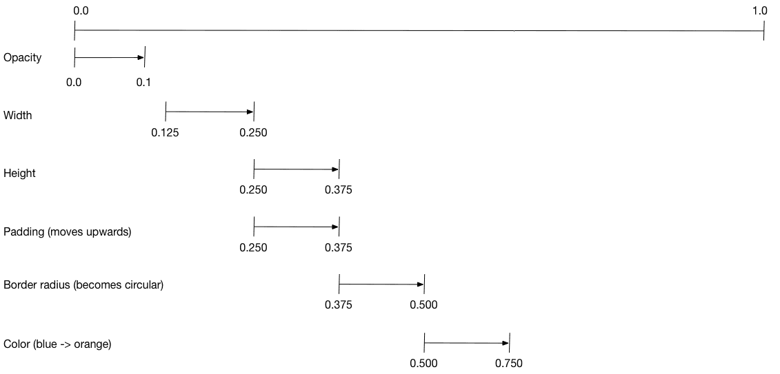
Diagram showcasing the specified intervals for each motion.
To configure the animation:
Establish an AnimationController responsible for overseeing all Animations.
Craft a Tween for each property slated for animation.
The Tween delineates a range of values.
The animation method of the Tween necessitates the parent controller and yields an Animation tailored to that property.
Specify the interval on the curve property of the Animation.
Complete Staggered Animation
Detailed Implementation
Here’s a detailed implementation of a staggered animation in Flutter, where we animate the opacity, width, height, and padding of a container sequentially.
https://gist.github.com/ashutoshsr7/a6ba946962d5275c52733fa9a2d4d8b3
Stateless Widget: StaggerAnimation
Explanation and Example of a Stateless Widget for Staggered Animations
The StaggerAnimation class is a stateless widget that defines and manages the various animations using the Animation objects. It uses an AnimatedBuilder to rebuild its widget tree whenever any of the animations’ values change.
The AnimatedBuilder calls the _buildAnimation method to create the widget tree, which includes the animated properties like opacity, width, height, and padding. This method ensures that the changes in the animation values are reflected in the UI smoothly.
Stateful Widget: StaggerDemo
Explanation and Example of a Stateful Widget for Staggered Animations
The StaggerDemo class is a stateful widget that initializes and controls the AnimationController. It contains the logic to start the animation when the user interacts with the screen. This class ensures that the animation controller is properly initialized and disposed of, maintaining the animation lifecycle.
By using these two classes together, you create a cohesive and reusable structure for implementing staggered animations in your Flutter applications. The stateless widget handles the presentation logic, while the stateful widget manages the animation's lifecycle and user interactions.
With this comprehensive understanding of staggered animations, you can now create more sophisticated and visually appealing animations in your Flutter apps. In the next section, we’ll explore custom animations to further enhance your app’s user experience. Stay tuned!
Creating Delightful UIs with Staggered Animations
Staggered animations add an extra layer of dynamism to your Flutter applications by introducing delays between the start times of multiple animations. This technique can be particularly effective in creating engaging and visually appealing user interfaces. In this section, we'll explore practical examples of staggered animations and share some best practices for incorporating them into your projects.
Practical Examples
Staggered animations can be used to create a variety of eye-catching effects in your app's UI. Here are some real-world examples of how staggered animations can be implemented:
List Item Animations: When building lists of items, staggered animations can be applied to individual list elements to create a cascading effect as the items enter the screen. This not only enhances the visual appeal of the list but also provides feedback to the user that the content is loading or updating.
Image Gallery Animations: In image galleries or slideshows, staggered animations can be used to animate the entrance of each image with a slight delay, creating a dynamic and immersive browsing experience.
Menu Animations: Staggered animations can add flair to menu transitions by animating menu items or icons in a staggered fashion as the menu opens or closes. This not only makes the transition more visually appealing but also helps guide the user's attention.
Chat Interface: Bring conversations to life in a chat interface by animating message bubbles in a staggered sequence. As new messages arrive, bubbles can appear with subtle animations, mimicking a natural conversation flow and keeping users engaged.
Weather App: Create a dynamic weather app where weather conditions animate onto the screen with staggered animations. Raindrops can fall, clouds can drift, and sun rays can shine, providing users with a visually immersive experience of current weather conditions.
Map Interactions: Add depth to map interactions by animating markers, routes, and points of interest in a staggered manner. As users explore the map, markers can drop onto the screen, routes can draw themselves, and points of interest can animate into view, enhancing navigation and exploration.
By incorporating staggered animations into these practical examples, you can create UIs that are not only functional but also engaging and memorable for users. Experiment with different animation techniques and tailor them to your app's unique requirements to maximize their impact on user experience.
Custom Animated Widgets
Creating custom animated widgets in Flutter allows you to develop unique and engaging user experiences tailored to your app's specific needs. By understanding and utilizing the power of Flutter’s animation framework, you can build smooth, dynamic interfaces that captivate users. Let's dive into the process of building custom animations and walk through a step-by-step guide with a practical code example.
Building Custom Animations
When creating custom animated widgets, you harness the flexibility of Flutter's low-level animation APIs, such as AnimationController and Tween. This approach provides fine-grained control over the animation process, enabling you to animate multiple properties and design intricate animations that standard widgets might not support out of the box.
Here's an outline of the key components involved in crafting custom animations:
AnimationController: Manages the animation's lifecycle, including starting, stopping, and repeating.
Tween: Defines the range of values the animation should cover.
AnimatedBuilder: Rebuilds parts of the widget tree when the animation's value changes, ensuring a seamless visual update.
Step-by-Step Guide
Let's create a custom animated widget that changes both its size and color over time. Follow this detailed guide to see how it’s done:
Set Up the Animation Controller: Start by creating an
AnimationControllerto manage the animation's duration and playback.Define the Tweens: Create
Tweenobjects to specify how the size and color should change throughout the animation.Use AnimatedBuilder: Leverage
AnimatedBuilderto rebuild the widget with the updated animation values.Dispose the Controller: Ensure you clean up resources by disposing of the
AnimationControllerwhen it's no longer needed.
Here’s the complete code example:
Performance Optimization for Advanced Animations
Creating advanced animations in Flutter can greatly enhance user experience, but they can also be resource-intensive. To keep your animations smooth and avoid performance issues like jank, consider the following tips and techniques:
Tips and Techniques
Use Hardware-Accelerated Animations: Utilize widgets like
AnimatedContainerandAnimatedOpacitythat leverage GPU acceleration for smoother animations.Minimize Rebuilds: Use
AnimatedBuilderandAnimatedWidgetto rebuild only necessary parts of the widget tree during animations.Efficient State Management: Implement state management solutions like
ProviderorBlocto reduce unnecessary widget rebuilds.Profile Your Animations: Use Flutter DevTools to identify and address performance bottlenecks.
Performance Optimization Techniques
Reduce Widget Count: Simplify the widget tree by reducing the number of widgets involved in animations.
Optimize Images and Assets: Compress images and use vector graphics to minimize the load on the system.
Cache Expensive Operations: Cache results of complex calculations or data fetches to avoid repeated heavy operations.
Use Tween Sequences: For complex animations, use
TweenSequenceto create smooth transitions without overloading the system.
Future Trends and Best Practices
As Flutter continues to evolve, so do the possibilities for sophisticated animations. Here are some trends to watch out for shortly:
Upcoming Trends
Declarative Animations: Expect more intuitive ways to declare animations, reducing code complexity.
AI-Driven Animations: AI will help create personalized and adaptive animations based on user behavior.
Enhanced Performance: Look for improved GPU acceleration and rendering pipelines for smoother animations.
Cross-Platform Consistency: Flutter aims to ensure animations look identical across all platforms.
3D and AR/VR Animations: Support for 3D animations and AR/VR interfaces will expand, enabling immersive experiences.
Simple Practice Tasks for Advanced Flutter Animation Techniques
Task 1: Animate Multiple Properties
Objective: Create a Flutter widget that animates multiple properties simultaneously.
Instructions:
Create a new Flutter project.
Design a widget (e.g., a card) that will simultaneously animate its size, color, and rotation.
Use the
AnimationControllerandTweenclasses to animate these properties.Implement a button that starts the animation when pressed.
Example:
Animate a card that grows in size, changes color from blue to red, and rotates 360 degrees when the button is pressed.
Task 2: Implement Staggered Animation
Objective: Build a simple Flutter app with staggered animations.
Instructions:
Create a new Flutter project.
Design a list of widgets (e.g., images or text fields) that will appear with staggered animations.
Use the
Intervalclass to stagger the animations of each widget.Ensure that each widget has a slight delay before its animation starts, creating a cascading effect.
Example:
Display a list of images that fade in and slide up from the bottom with a 100ms delay between each image.
Task 3: Create a Custom Animated Widget
Objective: Develop a custom widget that includes its animation logic.
Instructions:
Create a new Flutter project.
Define a custom widget that animates its appearance.
Include properties that control the animation, such as duration and curve.
Provide methods to start, stop, and reverse the animation.
Example:
Create a pulsating button that grows and shrinks continuously. Allow customization of the pulsation speed and size through widget properties.
Task 4: Build a Simple Animated UI Element
Objective: Enhance a basic UI element with animation.
Instructions:
Create a new Flutter project.
Design a basic UI element (e.g., a loading indicator or a button) and add animation to it.
Use built-in Flutter animation classes and controllers to implement the animation.
Ensure the animation runs smoothly and enhances the user experience.
Example:
Implement a bouncing ball loading indicator that moves up and down repeatedly while data is being loaded.
Task 5: Combine Techniques in a Mini Project
Objective: Integrate multiple animation techniques into a cohesive mini-project.
Instructions:
Create a new Flutter project.
Design a simple app that requires multiple animation techniques.
Animate various properties of different widgets.
Implement staggered animations for a series of elements.
Use a custom animated widget as a part of the UI.
Example:
Develop a login screen where the app logo scales up and rotates, the input fields appear with a staggered animation, and the submit button changes color when hovered over.
Flutter Learning Resources
Introduction to Animations in Flutter
Key Concepts: Tween, Animation, AnimationController.
Types of Animations: Implicit vs. explicit.
Read More: Introduction to Animations in Flutter
Exploring Implicit Animations in Flutter
Understanding implicit animations and their widgets.
Introduction to widgets like AnimatedOpacity, AnimatedPadding, and AnimatedAlign.
Read More: Exploring Implicit Animations in Flutter
Diving into Explicit Animations in Flutter
Difference between implicit and explicit animations.
Core components: AnimationController, Animation, and Tween.
Read More: Diving into Explicit Animations in Flutter
Advanced Animation Techniques in Flutter
Animating multiple properties with TweenSequence and Interval.
We are creating complex sequences with staggered animations.
We are building custom animated widgets.
Read More: Advanced Animation Techniques in Flutter
Leveraging Animation Libraries in Flutter
Introduction to popular animation libraries like flutter_animate and Rive.
Basic setup and examples using flutter_animate.
We are integrating Rive animations into Flutter apps.
Read More: Leveraging Animation Libraries in Flutter
Creating Seamless Transition Animations in Flutter
Introduction to page transitions and custom transitions.
I am using PageRouteBuilder for custom transitions.
Creating smooth transitions with Hero widgets and shared element transitions.
Read More: Creating Seamless Transition Animations in Flutter
Optimizing Animation Performance in Flutter
Identifying common performance bottlenecks.
Techniques for optimizing animations for smooth performance.
We are using Flutter's performance tools to monitor and improve animations.
Read More: Optimizing Animation Performance in Flutter
Real-world Examples and Case Studies of Flutter Animations
Analysis of popular apps with rich animations (e.g., weather apps).
Breakdown of complex transitions in productivity apps.
Best practices and lessons learned from real-world examples.
Read More: Real-World Examples and Case Studies of Flutter Animations
Download Our Flutter-based App Builder - Blup
Discover Blup: The Ultimate Flutter-Based Low-Code App Builder
Blup simplifies mobile and web app development with its intuitive interface and powerful features. As a Flutter-based low-code and visual development environment, Blup empowers you to bring your ideas to life quickly and efficiently.
Key Features:
Visual Environment: Customize designs in real-time.
Drag and Drop Interface: Build intricate layouts effortlessly.
Custom Widgets: Access a rich library of pre-built widgets.
Low-Code Development: Define app behavior with minimal coding.
Real-Time Preview: Receive instant feedback on app logic.
Event Handling: Manage interactions visually with ease.
Integrated Backend Services: Simplify data storage and user authentication.
API Integration: Seamlessly connect to third-party services.
Database Management: Tools for efficient data handling.
Efficiency: Speed up development with pre-built templates and components.
Flexibility: Customize your app with a vast library of widgets and plugins.
Community Support: Join a vibrant developer community with abundant resources and support.
Get Started Today! Download Blup now and unleash your creativity to build beautiful apps effortlessly.
Conclusion
We've explored advanced Flutter animation techniques, including animating multiple properties, implementing staggered animations, and creating custom animated widgets. These techniques can significantly enhance your app's user experience.
Encouragement to Experiment and Innovate
Experiment with these animation techniques in your projects. Innovate and push the boundaries to create unique and engaging user experiences.
Teaser for the Next Blog
Stay tuned for our next blog, where we'll dive into integrating Flutter animations with third-party libraries, optimizing performance, and using animations in complex real-world applications. Elevate your Flutter skills to the next level!
Table of content


